The Dashboard provides a high-level view of turf moisture and weather trends, beginning with the results of your most recent scan. Key features include:
1. Scan Analytics and Global Fairway & Greens Graphics
Select a scan date
You can select a specific scan date directly from the calendar in the top left of the Dashboard. All data on the page updates accordingly - including the trend graph, global gauges, weekly overview, hole statistics, sprinkler statistics, and sprinkler counts.

At the very top, you’ll see analytics from your most recent scan. This section shows five colored circles - Very Dry, Dry, Target, Wet, and Very Wet - each with a number inside indicating how many sprinkler heads fall into that category.You can adjust the thresholds behind these categories, so they match the conditions you want to achieve on your course.

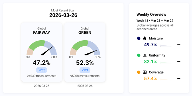
Alongside this, the global fairway graphic provides a percentage-based summary of overall moisture conditions across the course, indicating whether areas are within target, too dry, or too wet. Next to it, the global greens graphic offers the same high-level view for greens, including the total number of measurements from the most recent scan and an overview of moisture distribution.
You’ll also see a weekly overview summarizing global averages across all scanned areas. This includes key performance metrics such as: Moisture (%), Uniformity (%), and Coverage (%).
2. Area and Sprinkler Insights
Holes that fall into the wet or dry categories are listed, each with a snapshot of their moisture levels. This makes it easy to see where issues might be developing and gives you a course-wide overview without needing to drill down into each tab.
You can also switch between viewing areas (holes or greens) and sprinklers, allowing you to see all sprinklers that fall into the wet and dry categories, along with key statistics such as average moisture, uniformity, and area type.
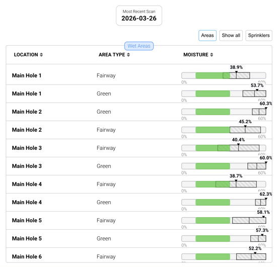
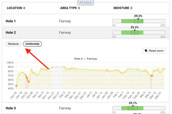
This table also provides quick access to moisture and uniformity trends. Click any row in the Areas view to open a 30-day moisture trend for that hole, with an additional tab for uniformity trends (see below). The same functionality is available in the Sprinkler view, allowing you to review performance over time for individual sprinklers.
3. Moisture Trend & Weather Data
The moisture trend chart ties everything together with weather data. You can track moisture levels globally or per hole alongside air temperature, predicted precipitation, and additional metrics such as evapotranspiration (ET₀).
The chart can be customized to show data from 7 to 365 days or a selected custom range.
You can also apply a crop coefficient (Kc) to better reflect how your turf uses water. Default values (e.g., 0.6 for warm season, 0.8 for cool season) provide a starting point, but turfRad allows you to refine this further using your own field data.
Using Predict Mode to fine-tune Kc
Predict Mode combines observed moisture data with hourly evapotranspiration from the weather model to project moisture trends for the next 48 hours. It can also be used to calibrate your crop coefficient:
- Compare measured moisture data with the predicted curve
- Adjust the Kc value until the predicted trend aligns smoothly with your actual measurements (without sudden jumps)
- This ensures the model reflects how your turf is actually using water under your course conditions
→ For more guidance, see: Determining Your Kc with turfRad Predict
Note: Kc values may not transfer directly between systems, as different platforms can use different ET₀ models. Always compare ET₀ sources before applying the same Kc elsewhere.
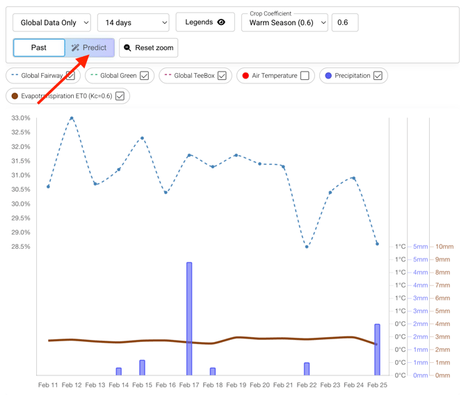
The Predict tab works for any date you select in the Dashboard calendar - not just today. When you select a past date, the Predict tab shows hourly moisture data within a 5-day window centred around that date, making it easier to review and compare conditions around a specific event or irrigation run.
4. Weather Chart
The Dashboard also includes a detailed weather chart that provides additional context for moisture trends. This view shows hourly weather conditions, including forecasted weather throughout the day, air temperature, soil temperature (6 cm depth), precipitation and rain probability, as well as wind conditions.

This helps connect environmental factors with observed moisture changes and supports more informed irrigation decisions.
Demo Video